May 27, 2015
Navigation Bars: Positioning
One of the first elements that I consider while designing a webpage is the navigation bar. It serves an important role on every website and as I browse through multiple sites a day, I’ve noticed some recurring trends. It’s made me think about the user interface of navigation bars, so I decided to take a closer look at them. In this post I’m going to focus on the positioning of navigation bars. These are just personal observations and not a guide on how navigation bars should or should not be presented.
At The Top
The position of the navigation bar is almost always on the top. When I visit a site, I almost always expect to look at the top to guide me around the site. To me, a navigation bar on the top seems the most natural. It’s like adding another toolbar to your browser that’s specific to the webpage you’re currently on.
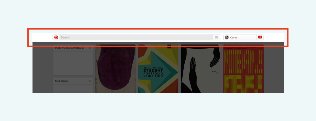
Fixed, Absolute, or Hidden At The Top
Sometimes the navigation bar is fixed (always visible when you scroll) or absolute (only at that exact position on the webpage). There are also variations of those two where it’ll hide itself when you scroll down, but after scrolling up a bit, the navigation bar will appear again. Here is a demo of what I mean: headroom.js. One of the first few places I found that did this was the Chrome app on my phone. Screen real estate is important especially on a small device so it was practical for the navigation bar to minimize itself, but I’m finding more websites that are implementing this as well.
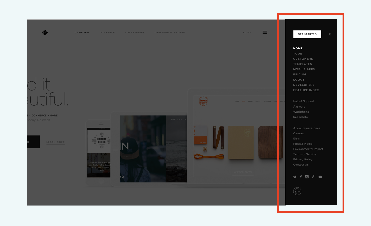
Hidden Sidebar Menu
Another type of position for the navigation bar that I’ve been seeing a lot more is this “hidden sidebar menu.” You usually have to click on a hamburger icon and a menu slides out with more links. It’s a great way to display links when there are too many to fit on a single bar.
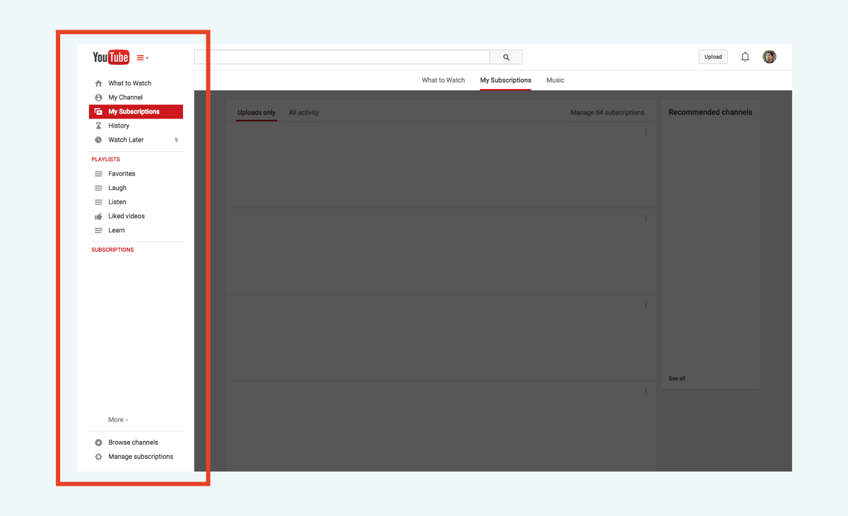
Fixed Sidebar Menu
It bugs me when I see sites that do this while there’s plenty of screen space available and in the menu I find only 3 links to choose from. I get that minimalism is great, but it wastes time to have to click open a menu and then click again, so if it’s avoidable, I’d just list out all the options in plain sight. Another feature that would be neat is that if the window is wide enough, to have the whole menu in plain sight fixed on the side. Youtube currently does this and gives you the ability to even show or hide it to your preference.
Another possibility could be switching a navigation bar between being fixed on the top or the side according to the window size. It would seem practical whether there is excess space vertically or horizontally and to have the navigation bar take up that excess space.
In the next post about navigation bars I’ll write about the content and the way it’s organized within the navigation bars.